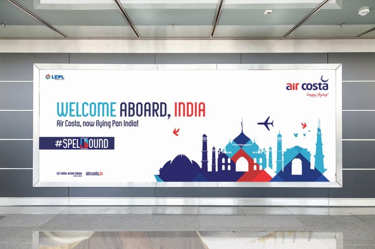
Rebranding Air Costa: A Journey of Trust, Design, and Partnership
Branding Beyond Aesthetics in Aviation
How does a regional airline stand out in an aviation market filled with global giants and low-cost carriers? For Air Costa, the answer wasn’t just about flight routes or ticket prices, it was about trust.
Passengers choose airlines not only for schedules but for how safe, valued, and cared for they feel. Every touchpoint matters: the boarding pass in their hand, the aircraft waiting on the tarmac, and the service that carries them through the skies.
Air Costa set out on a complete rebranding journey to reflect its ambition and provide passengers with a consistent, trustworthy experience. At Dcode Creative Solutions, we were invited to be part of this transformation, listening to Air Costa’s vision and shaping it into a cohesive identity system.
Though the airline eventually ceased operations, this rebrand remains a milestone in our story, a reminder of how thoughtful branding builds connection, trust, and recall.
The Challenge: Building Confidence in a Young Airline
Air Costa was competing in one of the world’s fastest-growing aviation markets. Larger players had market share, while low-cost carriers competed on pricing. To stand out, Air Costa needed more than fares, it needed a brand identity passengers could trust and remember.
The leadership team set out clear goals:
The leadership team set out clear goals:
- Strengthen trust in a young airline.
- Create consistency across every passenger-facing detail.
- Build distinct recall in a crowded marketplace.
- Support long-term growth ambitions while staying true to their values.
This clarity became the starting point of our collaboration.
The Approach: Expressing Vision Through Design
At Dcode, branding is more than design, it’s about creating ecosystems of trust and recognition. With Air Costa, the aim was not to reinvent, but to express what the airline already stood for in ways passengers could see and feel.
We worked with three guiding principles:
We worked with three guiding principles:
1. Consistency at Every Touchpoint: From plane tails to baggage tags, ensuring brand recognition everywhere.
2. Clarity in Communication: Keeping visuals and messaging direct, simple, and traveller-friendly.
3. Cultural Relevance with International Standards: A brand that felt proudly Indian while matching the polish of international carriers.
2. Clarity in Communication: Keeping visuals and messaging direct, simple, and traveller-friendly.
3. Cultural Relevance with International Standards: A brand that felt proudly Indian while matching the polish of international carriers.
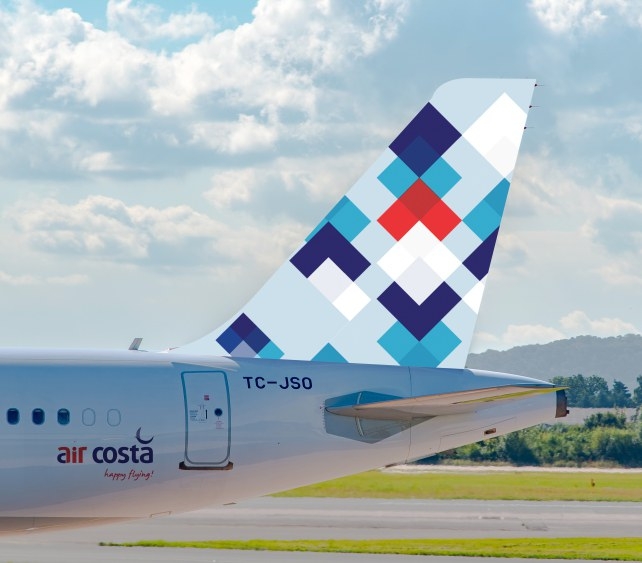
Visual Identity: Designing Confidence

The rebrand began with a refreshed visual identity:
Logo Evolution: A design symbolizing momentum and optimism, capturing the energy of a regional airline with bigger aspirations.
Typography: Clear and modern, designed to be equally effective on aircraft bodies and in small print.
Colour Palette: A balance of warmth and professionalism, signalling friendliness while reinforcing reliability.
Graphic System: Flexible supporting elements that created a design language adaptable across materials.
The goal was simple: not art for art’s sake, but a practical toolkit that supported Air Costa’s journey.
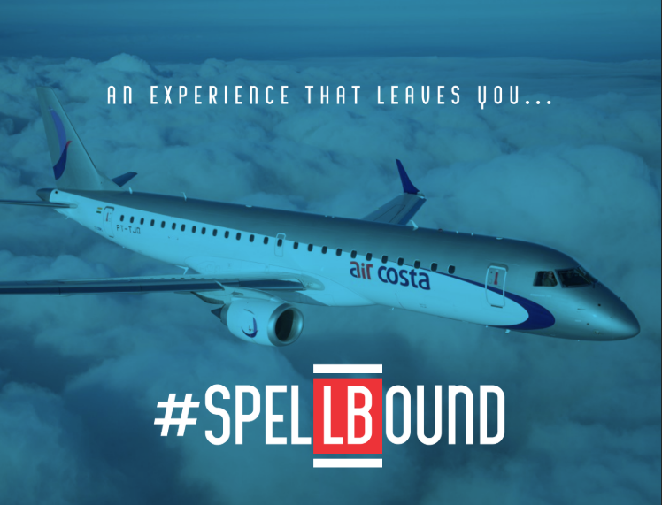
A Moving Canvas: Aircraft Livery
Few brand expressions are as iconic as an airline’s livery. For Air Costa, the aircraft itself became a moving canvas:
Exterior Design : Clean lines, confident logo placement, and balanced use of color made Air Costa planes stand out across India’s airports.
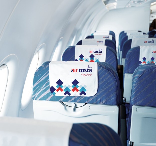
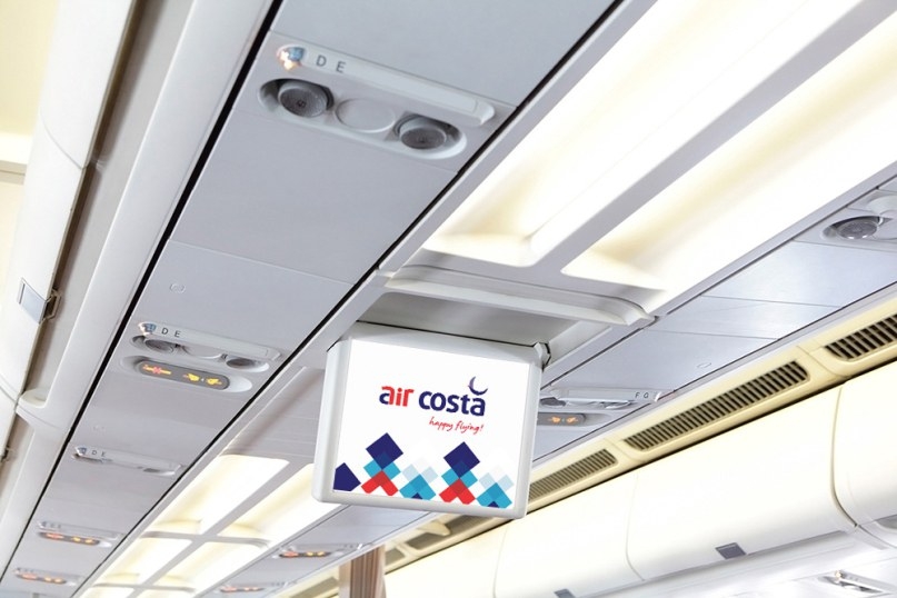
Interior Branding : Subtle touches on headrests, menus, and safety cards ensured the brand experience continued inside.
Every takeoff became a chance to tell the airline’s story.
Exterior Design : Clean lines, confident logo placement, and balanced use of color made Air Costa planes stand out across India’s airports.
Interior Branding : Subtle touches on headrests, menus, and safety cards ensured the brand experience continued inside.
Every takeoff became a chance to tell the airline’s story.
Passenger Journey: Branding in the Details
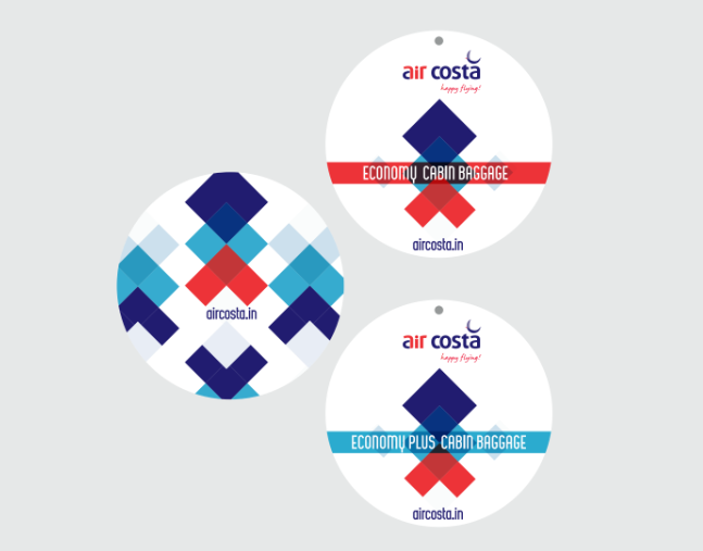
Air travel is a series of small but important interactions. We worked with Air Costa to align these touchpoints with the refreshed identity:
Boarding Passes & Tickets : Redesigned for clarity, carrying the new identity in functional, subtle ways.
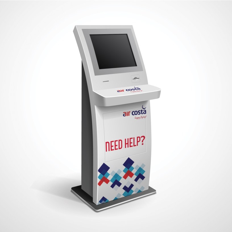
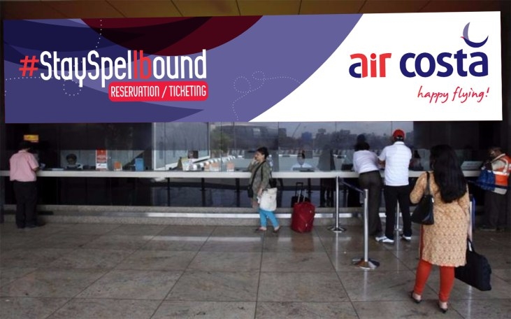
Check-In Counters & Kiosks : Signage and visuals reassured travellers from the very first step.
Baggage Tags & Labels: Small details that extended the brand into everyday travel.
Uniforms: Professional yet approachable, reflecting care and confidence.
In-Flight Materials: Menus, magazines, and safety cards carried the same design system, ensuring harmony.
Each detail built recognition and reassurance, turning routine tasks into trust-building moments.
Boarding Passes & Tickets : Redesigned for clarity, carrying the new identity in functional, subtle ways.
Check-In Counters & Kiosks : Signage and visuals reassured travellers from the very first step.
Baggage Tags & Labels: Small details that extended the brand into everyday travel.
Uniforms: Professional yet approachable, reflecting care and confidence.
In-Flight Materials: Menus, magazines, and safety cards carried the same design system, ensuring harmony.
Each detail built recognition and reassurance, turning routine tasks into trust-building moments.
Extending to Digital and Communication
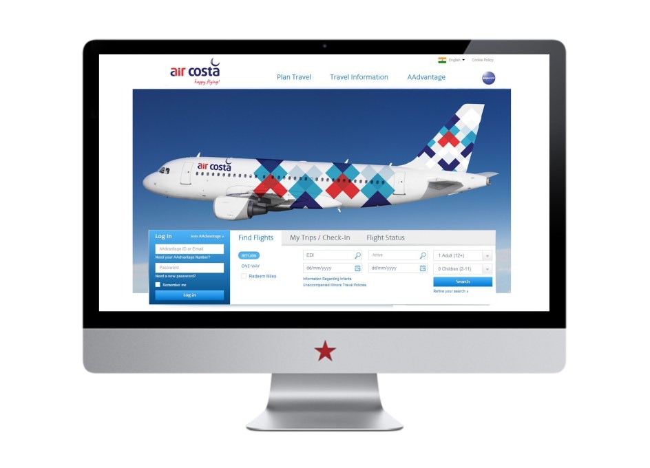
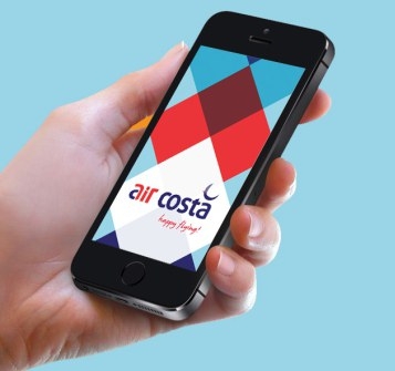

In a digital-first world, an airline’s website and app are just as important as its aircraft. Air Costa’s rebrand extended online and beyond:
App & Website : Updated UI for smooth digital booking and check-ins.
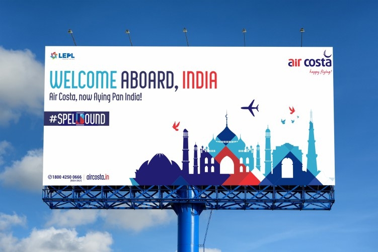
Advertising Campaigns : Consistent branding across print, outdoor, and digital media.
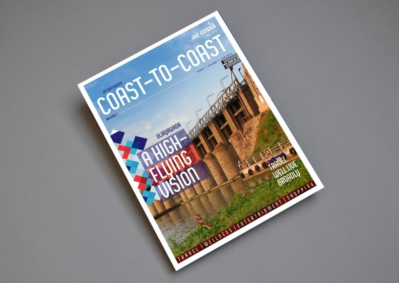
Brochures & Route Maps : Informational tools redesigned as brand experiences.
Brand Guidelines: A framework to maintain identity across vendors and teams.
The result: A seamless brand across physical and digital channels.
App & Website : Updated UI for smooth digital booking and check-ins.
Advertising Campaigns : Consistent branding across print, outdoor, and digital media.
Brochures & Route Maps : Informational tools redesigned as brand experiences.
Brand Guidelines: A framework to maintain identity across vendors and teams.
The result: A seamless brand across physical and digital channels.
Why Consistency Creates Trust
In aviation, small inconsistencies raise doubts. A mismatch between website visuals and printed materials can unintentionally signal instability.
Air Costa’s rebrand aligned every detail under a single identity framework, projecting reliability, stability, and care. This not only built passenger confidence but also strengthened brand recall.
Air Costa’s rebrand aligned every detail under a single identity framework, projecting reliability, stability, and care. This not only built passenger confidence but also strengthened brand recall.
The Impact: A Stronger Identity
The rebranding gave Air Costa a refreshed presence in Indian aviation. Passengers experienced noticeable improvements, from aircraft design to check-in counters to uniforms.
For a time, Air Costa stood out as a regional airline with ambition and care for its travellers.
Though the airline later ceased operations, the project remains a proud milestone. For Dcode, it was an opportunity to help a brand turn vision into reality across hundreds of details.
For a time, Air Costa stood out as a regional airline with ambition and care for its travellers.
Though the airline later ceased operations, the project remains a proud milestone. For Dcode, it was an opportunity to help a brand turn vision into reality across hundreds of details.
Lessons from the Journey
The Air Costa rebrand left us with lessons that guide every project we take on:
Vision Comes from the Brand : Our role is to listen, interpret, and amplify.
Details Build Trust : Small touchpoints, from baggage tags to seat covers, make a big difference.
Consistency Creates Confidence : A unified brand identity reassures customers.
Partnership is Key : True success happens when brands and agencies collaborate with trust and clarity.
Conclusion: Walking Alongside Brands
The Air Costa rebranding was about more than visuals. It was about expressing ambition with clarity and consistency, so that passengers felt the trust behind every interaction.
At Dcode Creative Solutions, we see ourselves as partners, not heroes. Brands are the protagonists of their own stories, we simply walk alongside them, shaping details that bring their vision to life.
If your brand is ready to embark on its own journey of transformation, we're ready to walk alongside you.